Fonts in design: how to choose and not make a mistake?
Fonts are one of the key elements of design that affect the perception of a brand, ease of reading and the overall impression of content. A wrong choice can spoil even the most carefully thought-out layout. In this article we look at how to pick fonts for design, combine them correctly and avoid common mistakes.
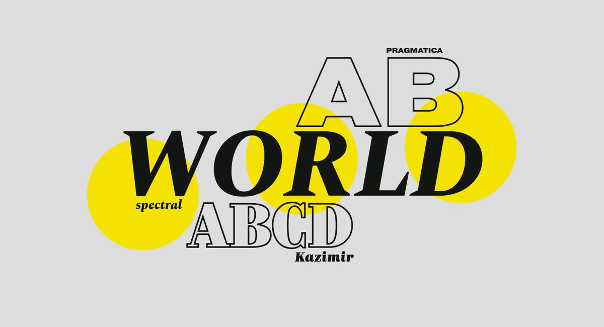
1. Why is the choice of font so important?

A font is not just letters but a tool for conveying emotion and style. It affects:
- Brand perception (strict, friendly, creative).
- Text readability (whether it is convenient for the user to take in information).
- The overall impression of the design (professionalism or chaos).
Examples of associations:
- Helvetica, Arial — neutrality, professionalism.
- Times New Roman — classic, formality.
- Comic Sans — informality, but often perceived as unprofessional.
2. The main types of fonts and their use
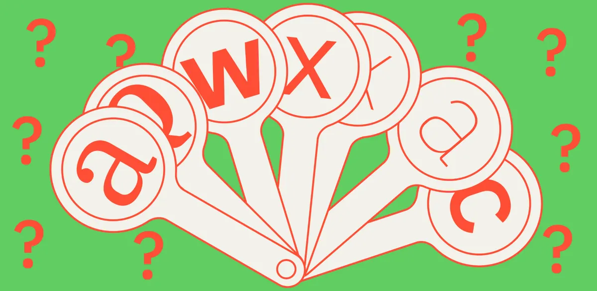
1. Serif
Examples: Georgia, Times New Roman, Garamond.
Where to use: books, print publications, premium brands.
Effect: classic style, elegance, reliability.
2. Sans-serif
Examples: Arial, Roboto, Montserrat.
Where to use: web design, interfaces, modern brands.
Effect: minimalism, technology, simplicity.
3. Script (Handwritten)
Examples: Pacifico, Lobster, Dancing Script.
Where to use: logos, invitations, creative projects.
Effect: friendliness, individuality.
4. Display (Decorative)
Examples: Bebas Neue, Impact.
Where to use: headings, posters, accent elements.
Effect: brightness, uniqueness.
3. How to combine fonts correctly?
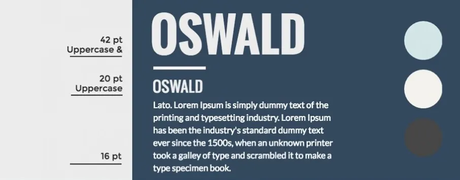
✅ Use 2–3 fonts (for example one for headings, another for text).
✅ Contrast in shape (serif + sans-serif).
✅ Keep the hierarchy (heading > subheading > body text).
✅ Check readability (fonts that are too thin or decorative make reading harder).
Examples of successful combinations:
- Playfair Display (Serif) + Montserrat (Sans-serif) — elegance and modernity.
- Raleway (Sans-serif) + Merriweather (Serif) — a balance of strictness and lightness.
- Bebas Neue (Display) + Open Sans (Sans-serif) — dynamics and readability.
4. 5 mistakes when choosing fonts

- Fonts that are too complicated — if the text is hard to read, the user will leave.
- A size that is too small or too large — breaks the balance.
- Many different fonts — creates chaos.
- Poor kerning (letter spacing) — worsens perception.
- Decorative fonts in body text — only for accents!
5. Where to download quality fonts?
🔹 Google Fonts — free fonts for websites.
🔹 Adobe Fonts — a premium collection.
🔹 Font Squirrel — free commercial fonts.
🔹 DaFont — non-standard and decorative options.
Conclusion
Choosing fonts is a balance between aesthetics and functionality. Take into account:
✔ Target audience (a formal or creative style).
✔ Readability (whether the text is comfortable to take in).
✔ Compatibility (contrast and harmony).
The right fonts will make your design professional and memorable! 🚀
#Design #Fonts #WebDesign #Typography #Graphics


