10 ways to optimize a website on mobile devices
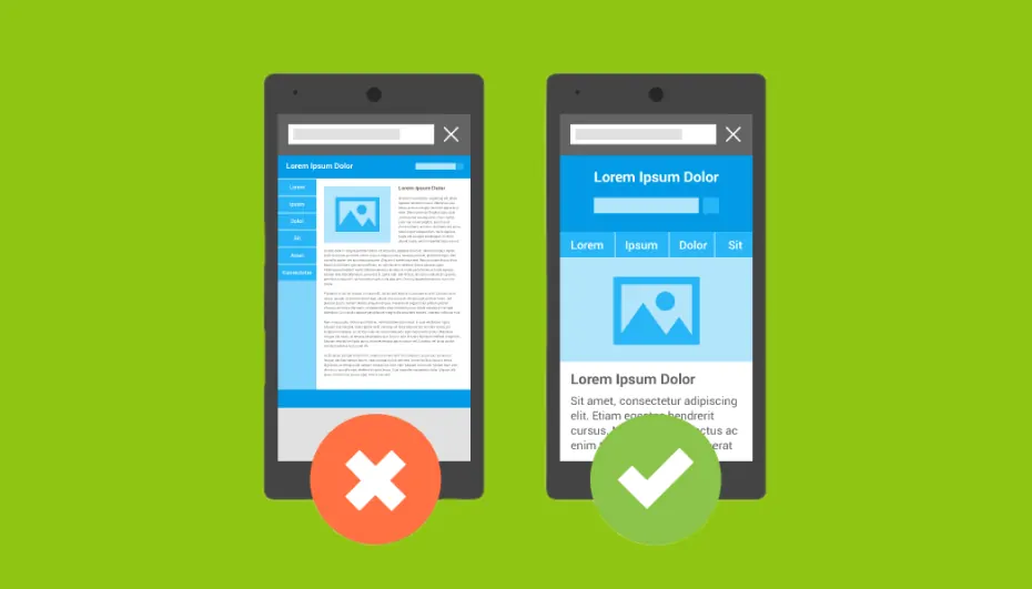
1. Use responsive design
Responsive web design automatically adjusts the elements of a website to the size of the device screen. This gives the user comfortable interaction with your content, regardless of screen size.
2. Speed up website loading
Loading speed is critically important for retaining users.
- Compress images with tools (for example, TinyPNG).
- Minify CSS, HTML and JavaScript.
- Use browser caching for frequently used elements.
3. Keep navigation simple
Make sure that buttons, menus and links are large enough to tap with a finger. Use an intuitive structure so that users can easily find what they need.
4. Test mobile compatibility
Regularly check how the website is displayed on different devices using tools such as Google Mobile-Friendly Test.
5. Optimize content for reading
Use a large, clear font (at least 16px) so that the text is easy to read. Divide content into short paragraphs with subheadings to improve perception.
6. Enable offline mode
Supporting offline functionality using technologies such as PWA (progressive web apps) will let users keep access to some content even without an internet connection.
7. Reduce the number of pop-ups
Pop-ups get in the way of mobile users. Use them sparingly, and if they are necessary, make sure they are easy to close.
8. Adapt images and videos
Use image formats suitable for mobile devices (for example, WebP). For video, add settings for automatic resizing to the screen.
9. Set up a convenient feedback form
Forms should be simple and minimalist, with field autodetection (for example, for a phone number). Make sure the keyboard automatically switches to numeric when entering numbers.
10. Optimize local features and SEO
Mobile users often look for information on the go. Add call buttons, a map with routes and set up Google My Business for local queries.


